
Custom software
A mobile customer portal should preserve what each table value means
Keep product, unit and status relationships clear when a customer portal changes from a desktop table to a smaller-screen layout.
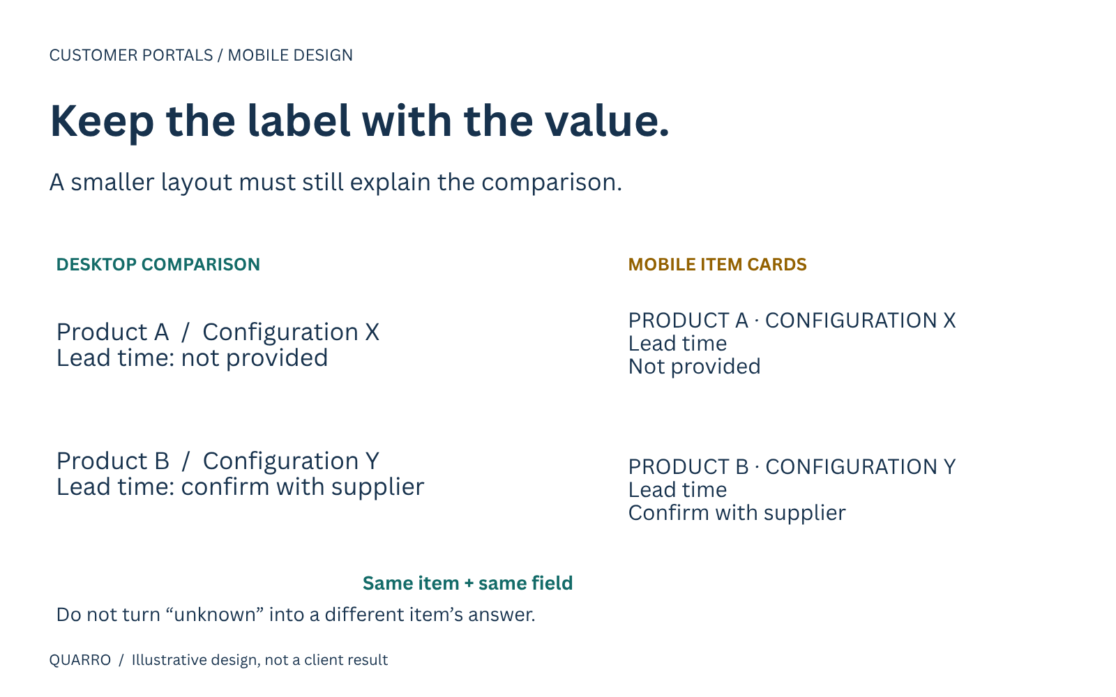
The comparison problem
A customer opens a product comparison on a phone and sees “Available,” “Five days” and “Request review.” The words fit the screen. What no longer fits is the context: which product, which location and which action each value belongs to.
A layout can become narrower without becoming easier to use. For a customer portal, the important question is not simply whether the table fits. It is whether the customer can still make the intended comparison and act on the correct item.
This article proposes a practical review method for that handoff from desktop table to small-screen interface. The mockup described here is illustrative, not a shipped Quarro implementation.
Begin with the decision the table supports
Imagine a distributor comparing two configurable products. A desktop table shows product name, requested configuration, availability note and estimated lead time. A buyer uses it to decide which item to ask about, not to place an unconditional order.
If the mobile design hides the configuration column to save space, the buyer might compare different configurations without realizing it. If it removes product names while scrolling horizontally, a useful value can become detached from the item it describes.
Write the task in plain language before choosing a layout: “Compare the lead-time notes for these two requested configurations, then request review of one.” That task identifies the labels and distinctions the redesign must preserve.
Meaning must exist beyond the visual grid
W3C's tables tutorial explains that data cells and their headers need programmatic relationships, so assistive technology can convey the table's context. Styled text alone is not a substitute for actual table structure. The tutorial also describes captions as a way to identify the table's subject. W3C Tables Tutorial.
Its practical guidance explicitly calls for preserving structural relationships when a table changes format on small screens or with enlarged text. It also warns against cutting off content that no longer fits. W3C table tips.
These principles establish the constraint. They do not select one universal mobile layout for every customer portal, and following this short article does not establish full accessibility conformance.
Choose between comparison and inspection
Two proposed options illustrate the trade-off.
Keep a simple table with usable horizontal scrolling. This can preserve side-by-side comparison when customers need several attributes at once. Make the existence of additional columns discoverable, keep essential identifying context available and test the actual scrolling and reading experience. A narrow screenshot alone cannot establish that the table is usable.
Present one labeled card per product. This can suit a task where customers mainly inspect individual items. Repeat the product identity and each field's label. Do not show a stack of unlabeled values merely because the original desktop headers existed elsewhere.
Cards can make direct comparison harder because the customer must remember values across cards. A table can require more navigation on a small screen. Select the design around the actual task instead of treating either pattern as automatically better.
Make ambiguous states explicit
In the illustrative portal, “Available” might mean listed in the catalog, held at a location or ready to promise. The interface should use the term supported by its source and explain material limitations near the decision.
Similarly, distinguish “not provided” from “not applicable.” A dash can hide both conditions. If an estimate is missing, a card should not silently borrow another product's value to keep the layout tidy.
Keep the action attached to its item. A button labeled “Request review” should make the chosen product and configuration clear before the customer confirms. If the page has filters, the selected item should remain understandable after a filter or sort changes the visible order.
Review a complete customer task
A bounded acceptance check can use the same representative information across desktop and mobile versions:
1. Identify both products and their configurations.
2. Find the same named attribute in each.
3. Explain an unknown or qualified value correctly.
4. Select the intended item and verify the confirmation names it.
5. Repeat with enlarged text and an appropriate assistive-technology review.
Ask the reviewer to explain what a value means, not merely whether it looks readable. Record the actual browser, viewport, input method and test outcome. An automated check can help find some implementation defects, but it is not evidence that a customer completed the comparison correctly.
Improve one table before redesigning the portal
Start with a table that supports a real customer decision. Inventory its labels, definitions, units, actions and missing-value states. Prototype the two plausible layouts, then test the same task against each before committing to a wider redesign.
That small project creates a useful specification for implementation and support: the relationships that must survive every layout change. A polished portal should preserve the meaning of the information, not merely rearrange it to fit a screen.